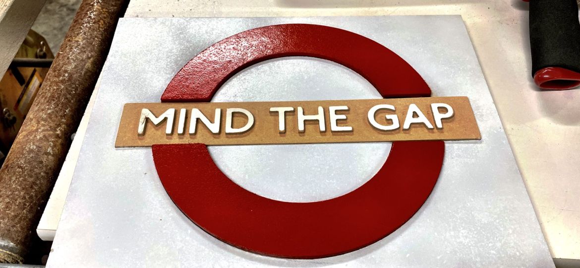
Much of making is about trial and error, especially when you are trying new things, and most of the time it is most about errors. Inlays were no different.
Originally I thought I could have the rounded, bar and wording as one piece. However, the fitting of the inlay was too tight, and I ended up destroying the raised lettering trying to press in the inlay.
In typography, a counter is the area of a letterthat is entirely or partially enclosed by a letter form or a symbol (the counter-space/the hole of). The stroke that creates such a space is known as a “bowl”. Letters containing closed counters include A, B, D, O, P, Q, R, a, b, d, e, g, o, p, and q.
Also the single piece inlay didn’t account for the counters of the D in MIND and A and P in GAP. The counters that cut by the X-Carve were too small and damaged. I would have hand-cut something to fit.
The final reason not use a single piece was for easier customization of the wording in the bar. Rather than inlaying the wording and dealing with the counters of some the lettering, I decided to raise the lettering. Separating the top and bottom arcs from the center bar would make this so much easier.


You must be logged in to post a comment.